
Today is all about returning back to the basics! Some of you may have experience with a color wheel, but I’d be willing to bet that a majority of quilters, sewists, and DIYers have never thought much about this useful tool. It’s incredibly helpful for those of us that like to sew with solid fabrics, rather than prints, or for those times when you just can’t find the right inspiration and have to come up with a color scheme on your own. Plus, knowing the rules of color gives you a lot of freedom to branch out and try color combinations that you might have not otherwise tried! So, today I give you an intro to color theory and how to use the color wheel.
Primary, Secondary, and Tertiary Colors — Oh my!
Let’s start off with the basics. The color wheel is separated into Primary, Secondary, and Tertiary Colors—don’t freak out, those are just fancy names for pure and mixed colors. The primary colors are good old Red, Blue, and Yellow, most of us remember this from our early school days (below on the left). Secondary colors happen when you mix any two primary colors (below on the right).
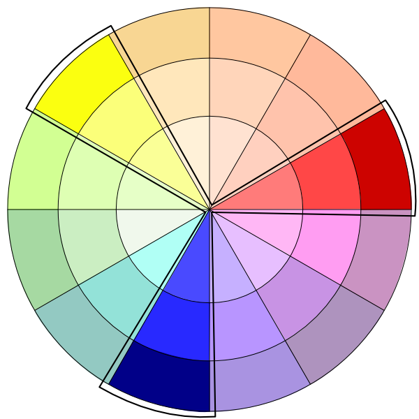

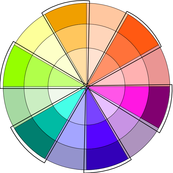
Tertiary colors happen when you mix a primary color with a neighboring secondary color. This is where we get Yellow-Orange, Red-Orange, Red-Violet, Blue-Violet, Blue-Green, and Yellow-Green.
Warm & Cool Colors on the Color Wheel
Now that we’ve got that down, there is one more color category within the color wheel. That is warm and cool colors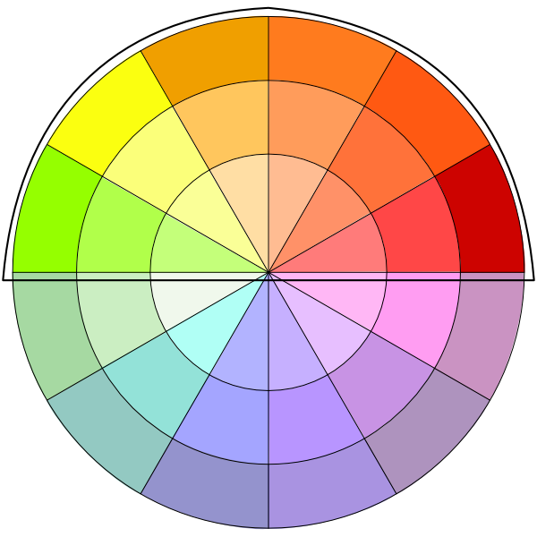 .
.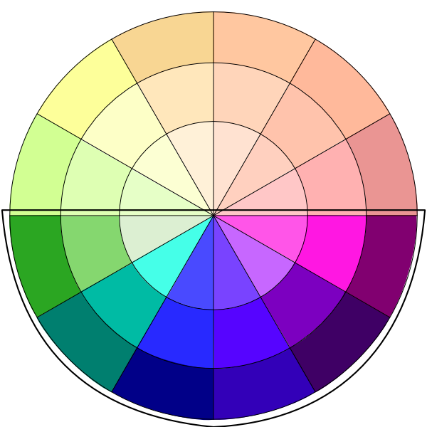
Warm colors tend to create more energy, excitement, and ____. The cooler colors tend to be calming and relaxing.
Color Combinations on the Color Wheel
I’m sure you’re wondering why any of this is important to you and your project. It’s important because knowing how colors work and interact will unlock new and unexplored territory for you in any project that involves color! I bet you never through of putting yellow and violet together, but guess what? You can!
Monochromatic Pallet

The Monochromatic color scheme is probably one of my favorites—it’s so clean and you simply can’t go wrong with it! The important part of keeping a good monochromatic scheme is to stick to your slice of the color wheel pie—don’t choose green and then start adding in blue-green, or some other slight variation of green. It’s a lovely finished product, but it can often be challenging to pull off a monochromatic scheme. Make sure to take your time and find everything that fits just perfectly together when working with monochromatics.

My Burst Throw Quilt is a great example of a monochromatic color scheme!
Analogous Color Scheme
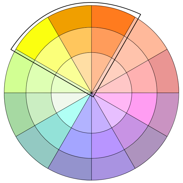
The analogous color pallet is similar to a monochromatic feel, but gives you far more freedom. With the analogous scheme you can choose anywhere from 2-6 colors that neighbor each other on the color wheel. I prefer to stick to 3-4 colors in most cases, but it’s a valid color scheme up to 6! This can be a really nice way to incorporate colors that you may not have initially put together. For example, my studio color scheme includes Blue, Blue-violet, and Violet—not my typical color direction, but I love how it turned out!
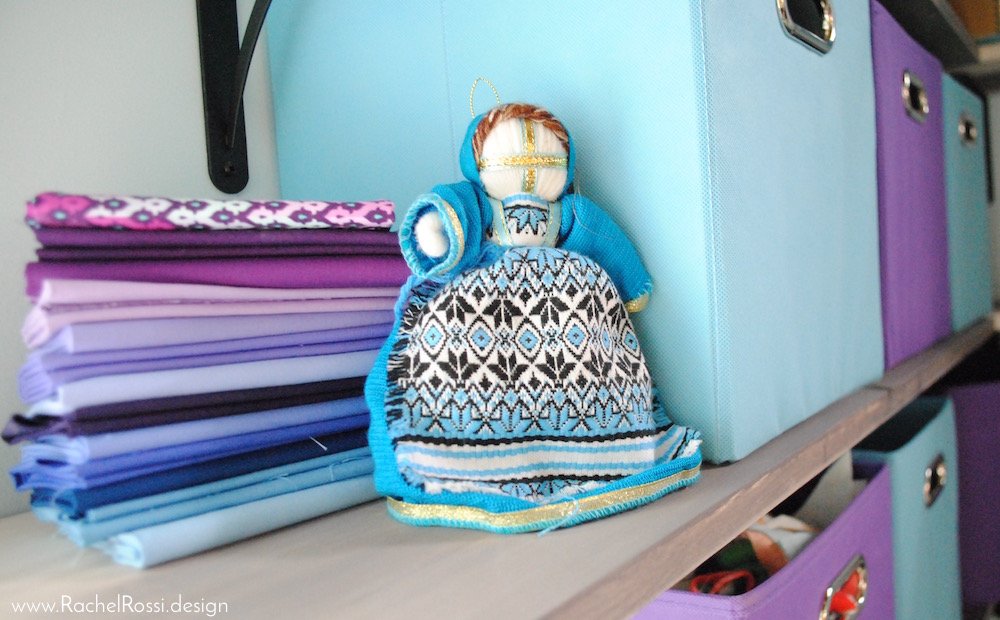
My office has an analogous color scheme running through it with combinations of blue, blue-violet, and violet!
Complementary Schemes
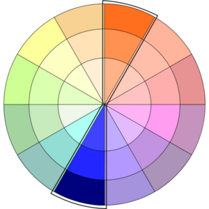
A color scheme that shows up EVERYWHERE is the complementary. Look at any college mascot and colors, and you’re more than likely to pick out complementary colors. Why is that? Because colors that oppose each other on the color wheel create a more vibrant sense of the other. That’s right—these colors actually improve each other by being paired together. As awesome as that is, it’s important to keep in mind, when using complementary colors, use different shades of each in order to not over-saturate the project!

My Crossroads quilt (coming in September!) uses a complementary scheme with goldenrod and blue hues.
Triad Color Pallet
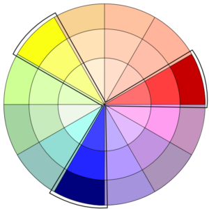
The triad color scheme is based on the relationship of primary colors to each other on the color wheel. In this color pallet you can choose any 3 colors evenly spaced out on the color wheel. So, if primary colors aren’t your cup of tea, try a Yellow-Orange, Red-Violet, and Blue-Green…you might just like what you see!
Color Wheel 102
I’d like to make a note here about shades. This is technically an intro to color wheels and how to use them, but I want to make sure you know this before you get rolling on your first project with a color wheel! While it’s important to use color schemes that work within the color wheel, you have to remember to use varying shades. For example, if you’re going for a Analogous color scheme, don’t use the darkest 3 colors that you can find—add some variety and varying shades of Blue or Blue-Violet to lighten it up. We’ll go into this more on my next post about color! I hope you’ve enjoyed Color Wheeling 101! What are your favorite color schemes? Are there any that you think I’ve missed? I’d love to see you comments below.
Enjoy reading this post? To make sure you don’t miss a thing, follow me on Pinterest, Facebook, and Instagram and sign up for an email subscription to my blog.

Hi
I enjoyed reading your post indeed.
Please advise if the combination of
Tan & lime is good
Thanks
Hi there,
Without seeing the colors, it’s hard to say. I would guess that they will look good together, but suggest that one is a darker saturation and one is lighter.
My husband and I are downsizing and I would like to use gray as my main color. Are there specific colors that I can mix with my dark gray sofa ?
Hi Ruth,
There aren’t too many rules for this sort of thing. I typically try to find an “inspiration piece” and then pull my colors from there. I’d suggest looking for wall art, curtains, pillows, etc. that have a matching dark grey in them and then pulling accent colors from that.