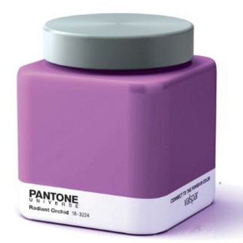
Though radioactive purple may be a surprise for the Pantone Color of the Year for 2014, Emerald Green, Tangerine Tango, and Turquoise, are just a few of Pantone’s previous choices in the past few years…and they were right about those! Will they be right with yet another unexpected prediction?
I have a feeling that they hit the nail on the head this year. This time next year we will probably question Pantone’s sanity once again, and, against all odds, they will have it right (again)!
Why, you ask? Well, for one, I have noticed violets becoming increasingly popular at home interior stores over the past few months. I’ve even used it in several of my designs and color consultations.

Read more about this color consultation on my Newlywed Paint Color Consultation post!
So, if this is indeed a Radiant Orchid kind of year, what does that color say to us? What kind of emotions, feelings and ideas are we bringing into our homes with Radiant Orchid?
Creativity
Yep! Violets are generally very creative. It takes passionate reds and stable blues to make this color, so it brings a lot to the table. It’s a great color for a studio or a child’s room.
Love & Joy
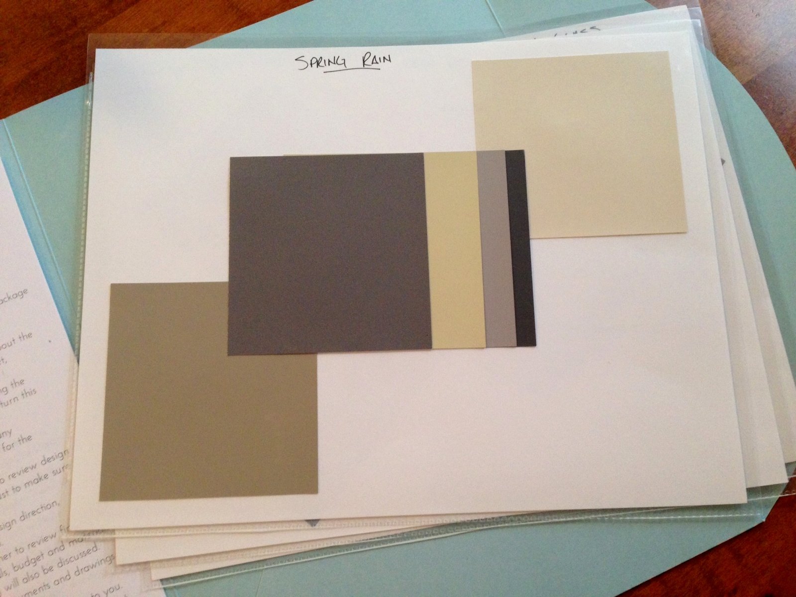
What are some things that you think of when you think of violet? Grapes, wine, flowers, Valentine’s Day…purples and violets have a lot going for them. In fact, in Western civilization, purples aren’t typically associated with anything negative. Typically this color family is associated with a more feminine palette, but paired with the right hues it can be just as masculine. Below is an inspiration board for a male client of mine. Darker violets are associated with wealth and power…can we say drama?
Doom & Gloom
With what we’ve just talked about in mind, it might be surprising that darker versions of this color can cause gloom, sadness, or even frustration. So choose your violets wisely! I would suggest something with more red/pink undertones as opposed to blue undertones.
Go for the Gold
Great, how am I going to get bright purple to work with my house? It’s actually not going to be all that hard. Violets often lend themselves to pairing up with reds or blues. Accent yellow rooms with different shades of violet for a complementary look. Or go bold. Make the majority of the room violet and accent with bright pops of metallic gold!
I’m excited to incorporate this trending color into my designs this year! What do you think of the Pantone Color of the Year for 2014? Has Pantone got it right? I’d love to see what you think in the comments below!
This was my Pantone Color of the Year post for 2014, make sure to see other years as well!


